
This title of this post is misleading because this topic applies to all design and not JUST Power BI. Actually, this topic is essentially about visual hierarchy or "systematic color design" but applied in a Power BI context. Neutral palettes are one of the most powerful yet underestimated tools in Power BI design. I see a lot of dashboards that feel cluttered or confusing—not because they lack good data, but because they’re missing a thoughtfully chosen neutral color scheme.
Great dashboards aren’t just about vibrant visuals; they’re about clarity, readability, and effortless usability. And that’s exactly where neutral palettes shine. Let’s talk about why getting your neutral colors right can make your reports feel polished, professional, and easy to understand.
What is a neutral palette?
A neutral palette is a set of carefully chosen shades that are low in saturation—think colors like grays, beiges, whites, and subtle earth tones. In Power BI, neutral palettes serve as the foundational background colors, borders, grids, and text elements that quietly support your report’s visual hierarchy without overpowering key information. Essentially, your netural palette is applied everywhere your brand colors aren't. Unlike bold brand colors, neutral shades play a supportive role, helping your visuals stand out clearly and guiding the viewer’s attention exactly where you want it.
Choosing a neutral palette
Your neutral palette should complement—not compete with—your data colors. Think of neutrals as a supportive backdrop that helps your vibrant brand and data colors truly stand out. If your data palette is warm-toned, consider neutrals with subtle warmth (like soft beiges or warm grays). If your data palette leans cool, opt for cooler neutrals (like blue-tinted grays). This harmony creates visual cohesion, making your dashboards both attractive and easy to understand.
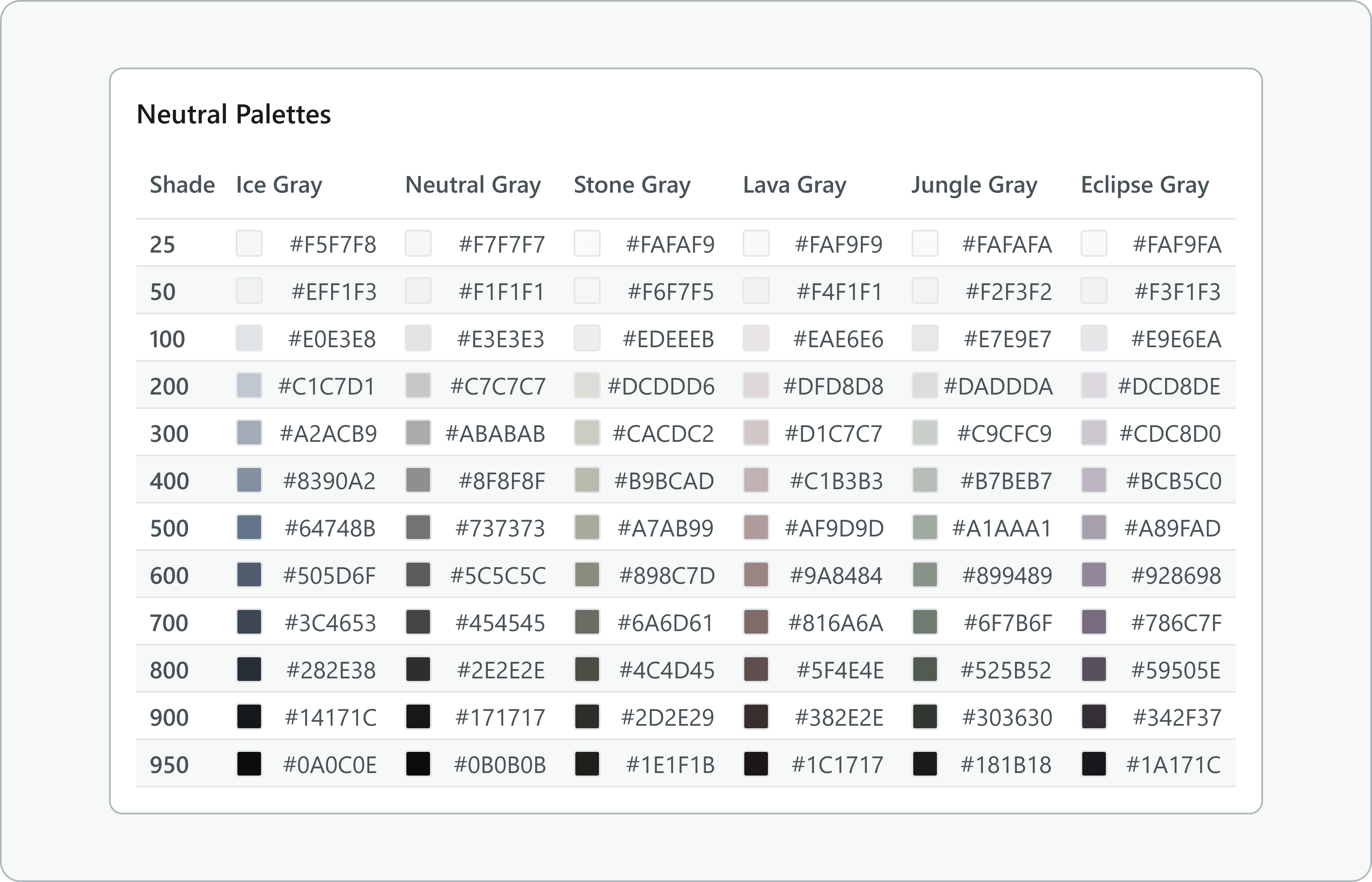
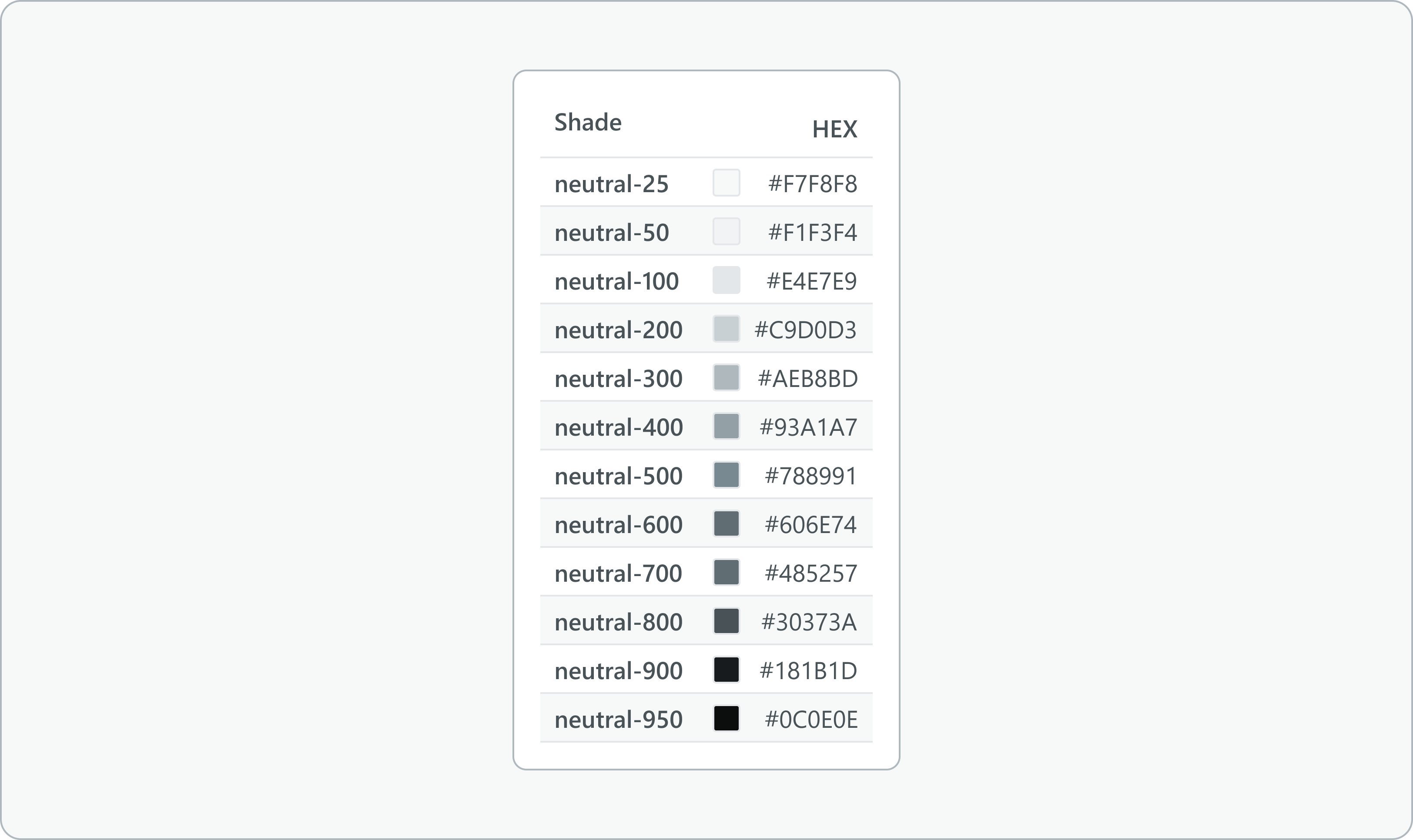
Start by selecting your base neutral color—like a subtle gray or beige—and then create a scale from very light (almost white) to very dark (close to black). Aim for even spacing between each shade so that transitions feel smooth and natural. Having about 10–12 distinct shades ensures you’ll always have the right neutral for any dashboard element, from subtle backgrounds to clear, readable text. Tools like Adobe Color, Coolors.co, or Tailwind (my personal favorite) can help you easily generate and fine-tune this gradient.

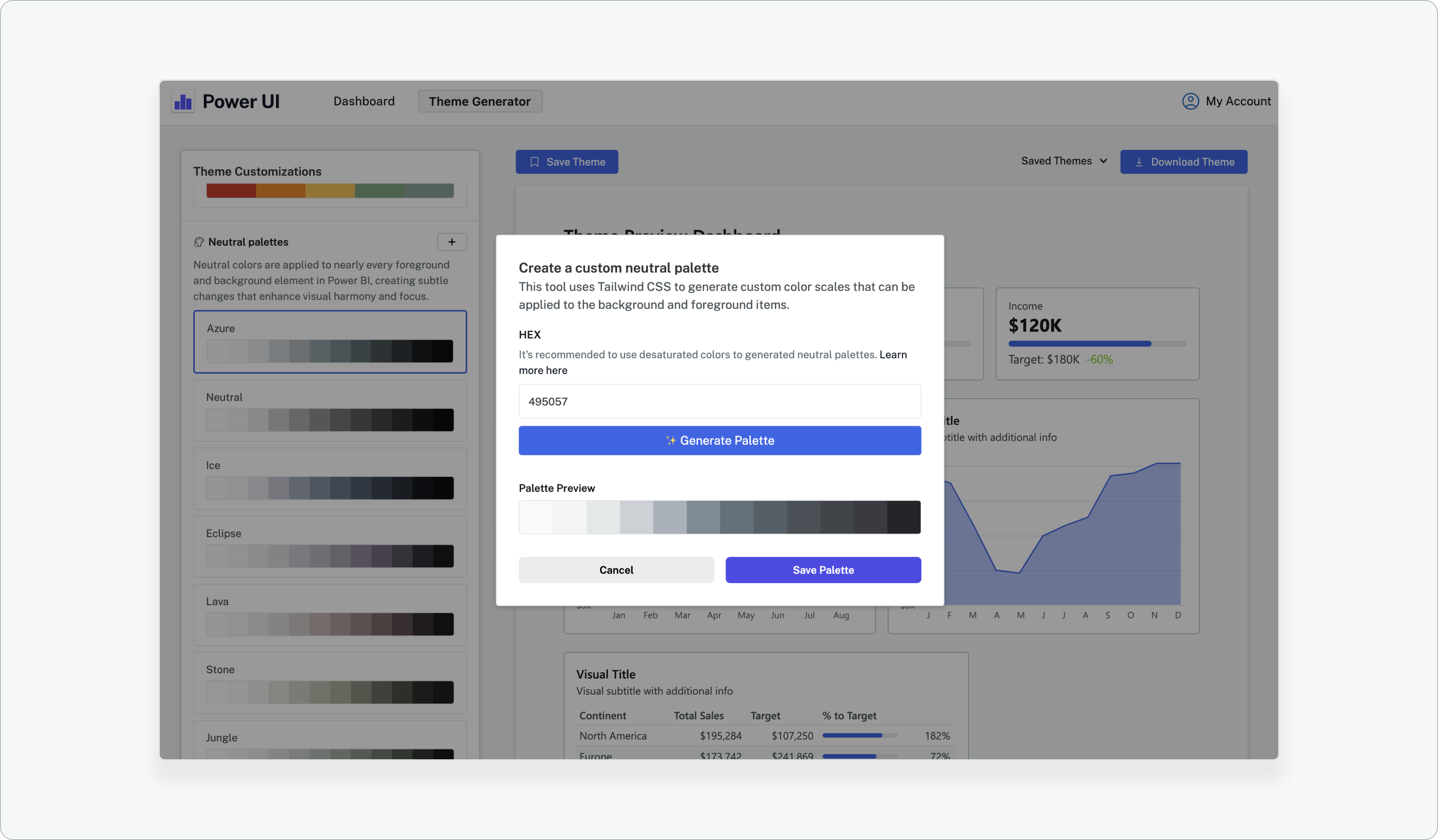
Neutral palettes in the Power UI theme generator
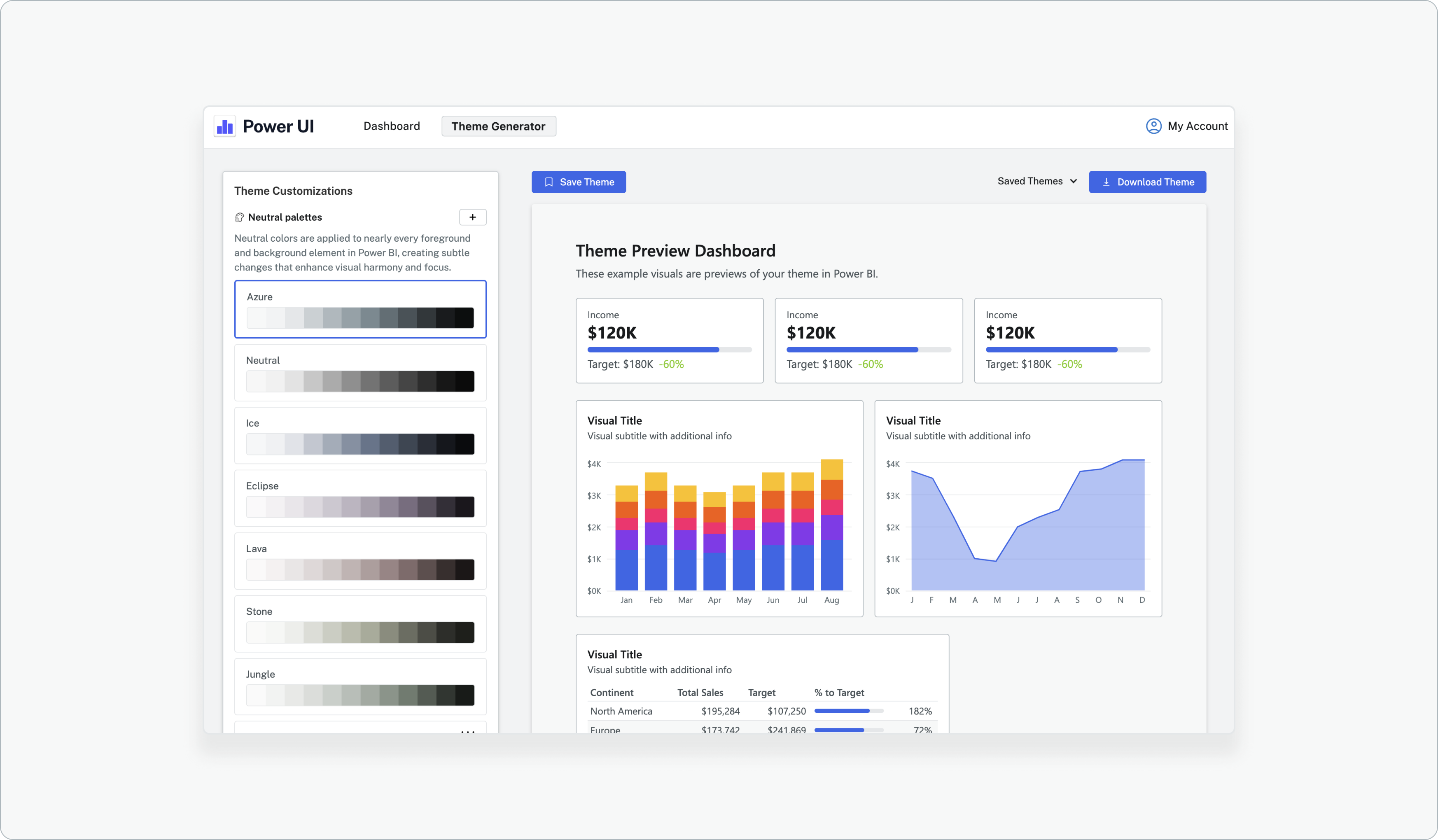
Power UI makes it effortless to apply a consistent neutral palette to your Power BI theme file. By integrating directly with the Tailwind API, Power UI lets you quickly generate a thoughtfully-designed neutral color scale. Once you’ve selected your palette, the shades automatically map into your theme file, ensuring every element—from backgrounds to borders and text—remains consistent, clean, and professional.
Here's the default Power UI neutral palette:
And here's a neutral palette with a purple tint to compliment the dark purple data colors:

You can try out unlimited combinations in the theme generator- even with dark mode!

Here's an example with a blue neutral palette in dark mode that uses a base shade closer to the brand color for a bold effect:

You can try out the 7 pre-configured neutral palettes in the Power UI theme generator but you'll have to purchase a license to generate custom palettes using the Tailwind CSS API.
Watch the saturation
Saturation refers to the intensity or purity of a color—how vivid or muted it appears. High-saturation colors are vibrant and eye-catching, while low-saturation colors are subtle, muted, and softer to the eye. Neutral palettes rely heavily on low-saturation shades because their subtle nature helps establish structure and readability without overwhelming or distracting the viewer. In other words, less saturated neutrals make your dashboards feel clear, calm, and professional, keeping the focus exactly where it belongs: on your data.
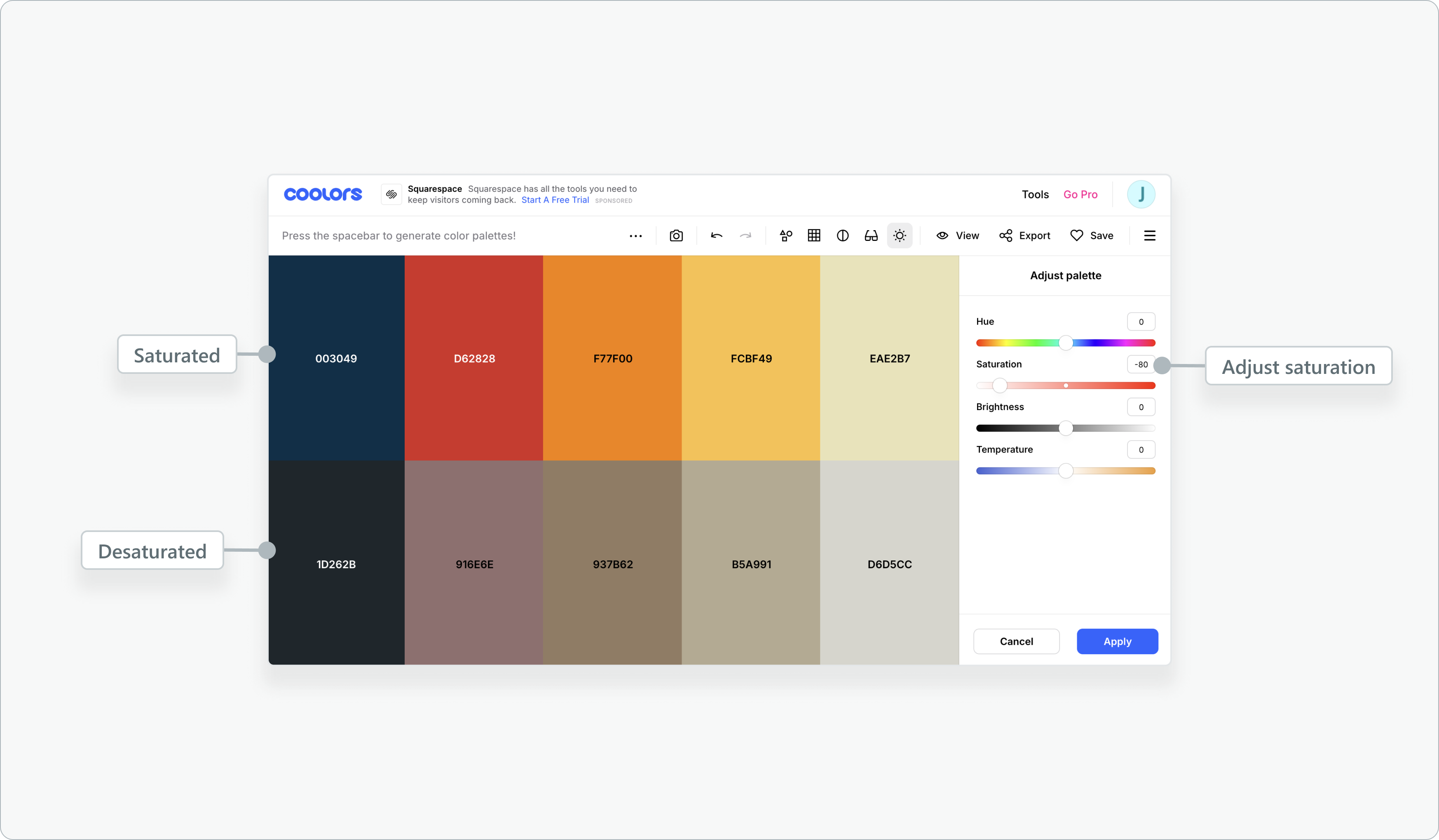
Here's an example of how dashboards can start to look bad if your neutral palette is too saturated. I'm using a dark theme to emphasize the point here. I generated this neutral palette using tailwind with #F77F00 as my base hex shade.

A token-based approach to theme creation
A token-based approach to theme creation means defining your colors and other design attributes using named "tokens"—or clearly labeled variables—that represent their specific roles in your dashboards. Instead of manually selecting colors each time you build or update your report, you simply reference these tokens.
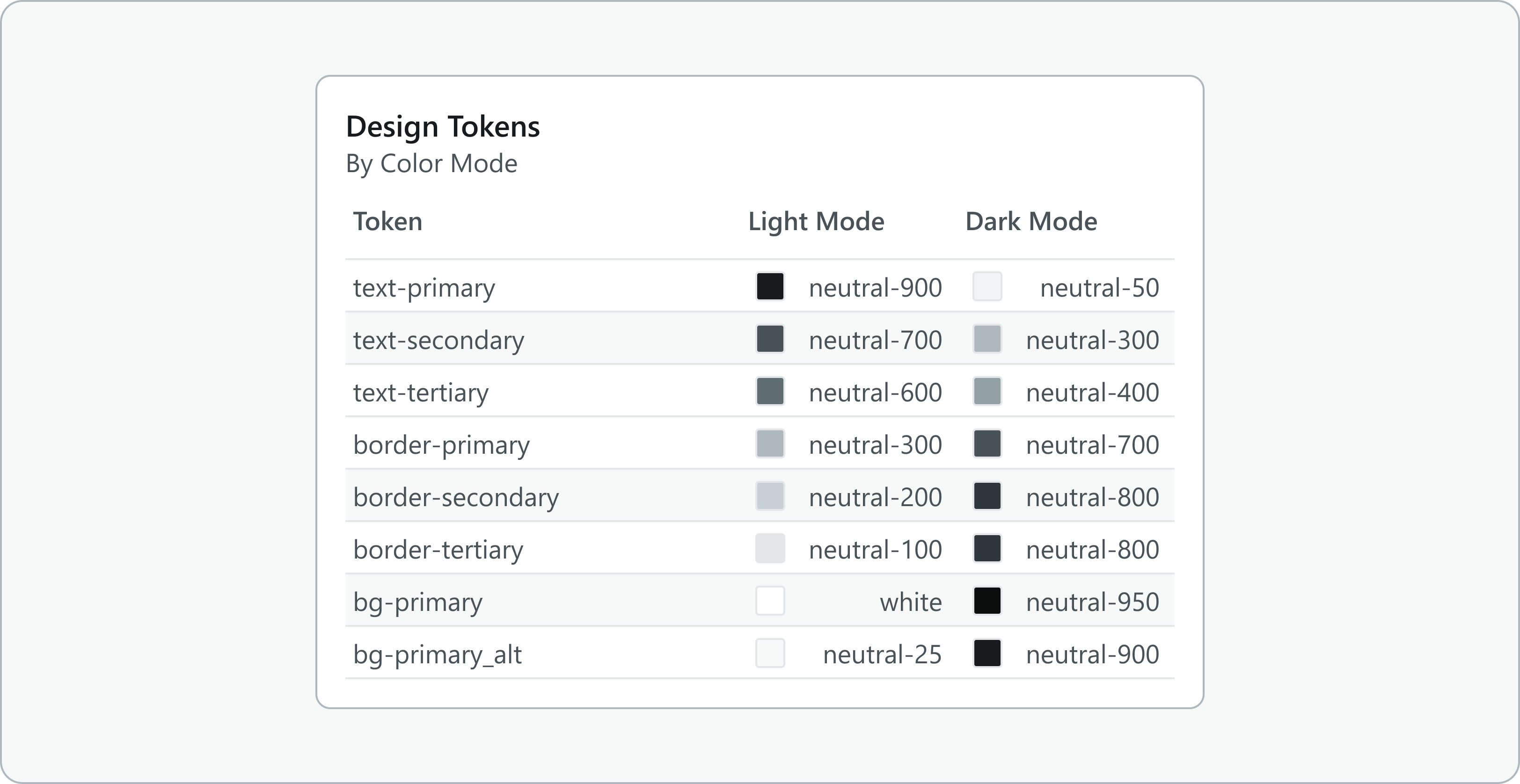
Here’s why this matters: tokens allow you to easily maintain consistency, streamline changes, and scale your design across multiple reports. By first defining neutral shades (like neutral-25 through neutral-950) and then mapping those shades to functional roles (such as text-primary, background-default, or border-subtle), you create a systematic approach that keeps your Power BI themes organized, clear, and effortlessly maintainable.
All of this happens automatically within the Power UI theme generator, making the process feel deceptively simple. But behind the scenes, there’s a thoughtful structure at work. Let’s explore what’s actually happening when you apply styles in the generator, and how you can use this token-based method to ensure consistent, professional-looking color application across your Power BI reports.
Step 1: Define your neutral palette
Create a scale, assigning each shade clear tokens, like neutral-25 (very light) through neutral-950 (very dark).
Step 2: Assign shades to functional tokens
Map these neutral shades to purposeful tokens like text-primary, text-secondary, background-default, border-subtle, and so on. These tokens reflect how you’ll actually use each color in your UI.
Step 3: Apply tokens in your Power BI theme file
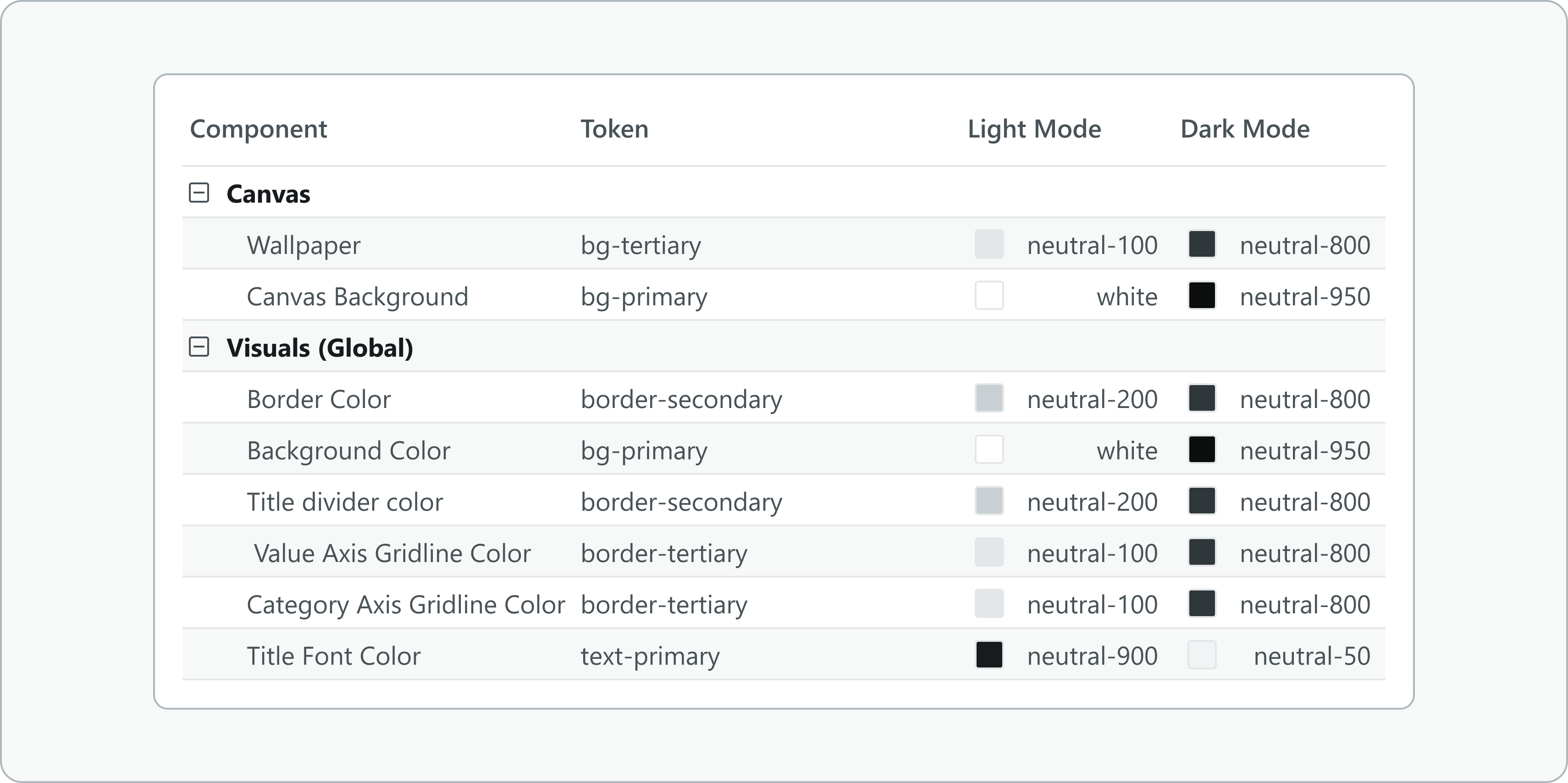
Use these meaningful tokens to style your report consistently, ensuring every component references the same color variable. This structured approach makes maintaining your theme simple, scalable, and intuitive—exactly what a professional design system is all about.
Apply these shades consistently
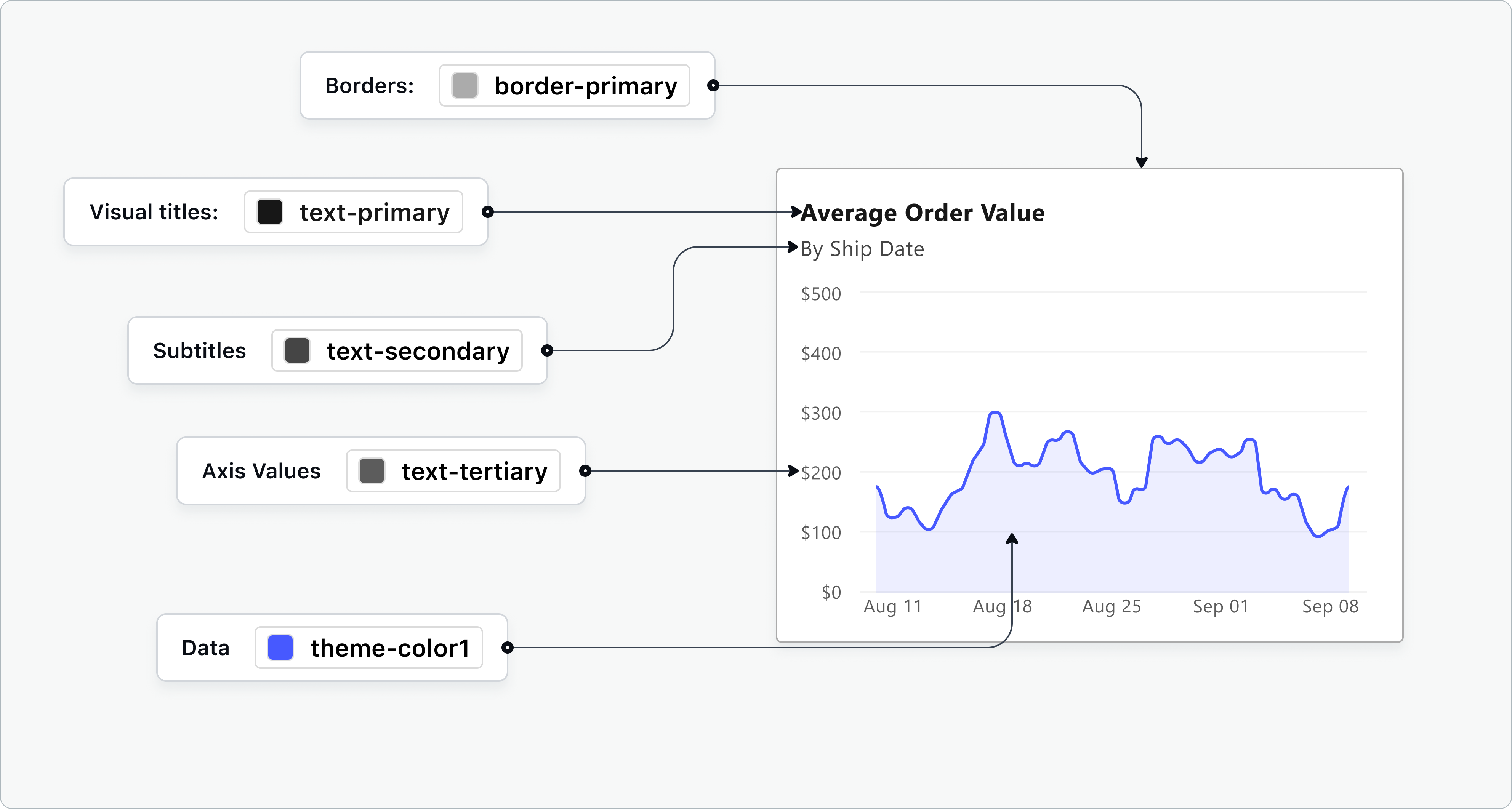
Applying your neutral shades consistently means assigning specific shades to specific dashboard elements—and sticking to it. For instance, always use your lightest neutrals for backgrounds, slightly darker shades for cards or containers, medium shades for grid lines or dividers, and your darkest neutrals for text and critical UI elements. This consistent usage helps users intuitively understand your report’s structure and hierarchy, creating a clean, professional, and easy-to-follow experience.
Use a theme file (or just use Power UI)
Applying your neutral shades consistently in Power BI means using a theme file. You're absolutely insane if you're customizing all the colors of every element on your canvas manually.
One of the major benefits of creating a theme file is scalability. Once you’ve established your design standards, applying them to multiple reports becomes effortless. Whether you’re working on a small internal report or a complex, client-facing dashboard, your theme file ensures that the design remains consistent. This also allows you to focus more on analyzing and presenting data rather than spending time tweaking visual settings across different projects.
Power UI does this by applying the token variables to a theme file and swapping colors out automatically based on your selections in this way:
{
    "name": "Custom Theme",
    "firstLevelElements": "text-primary",
    "secondLevelElements": "text-secondary",
    "thirdLevelElements": "background-subtle",
    "fourthLevelElements": "border-subtle",
    "background": "background-default",
    "secondaryBackground": "background-secondary",
    "tableAccent": "accent-primary"
}
I encourage you to start developing your own theme file. Use Power UI as the foundation since it already has professional design best practices built in. Though it may seem daunting at first, building it piece by piece will make the process more manageable. Over time, your theme file will become an invaluable resource, not only helping you maintain consistency and efficiency but also allowing you to evolve and refine your design approach as you gain more experience in Power BI.
A short rant about the default grays in Power BI
However, there are some nuances to the default gray colors to be aware of.
I'd like to have more shades of gray.
The default Power BI color palette includes 8 shades of gray (10 if you include black and white) which is generally sufficient to make modern interfaces. However, using a palette with more shades of gray allows for greater flexibility and contrast in your design.
An expanded gray palette gives you more control over subtle distinctions between elements, enhancing clarity and visual hierarchy. This added variety helps create a cleaner, more professional look while maintaining consistency throughout your report. Before I created Power UI I was always frustrated that the lightest shade of gray just wasn't light enough and I'd have to open the color picker every time I wanted to apply a lighter shades of gray. And since I was using the color picker the lighter shades wasn't always the same across visuals! This is why Power UI expands the neutral palette and offers 12 shades of gray.
The Power BI neutral shades are organized on the left side of the theme color picker. Here they are with their hex codes and names laid out:
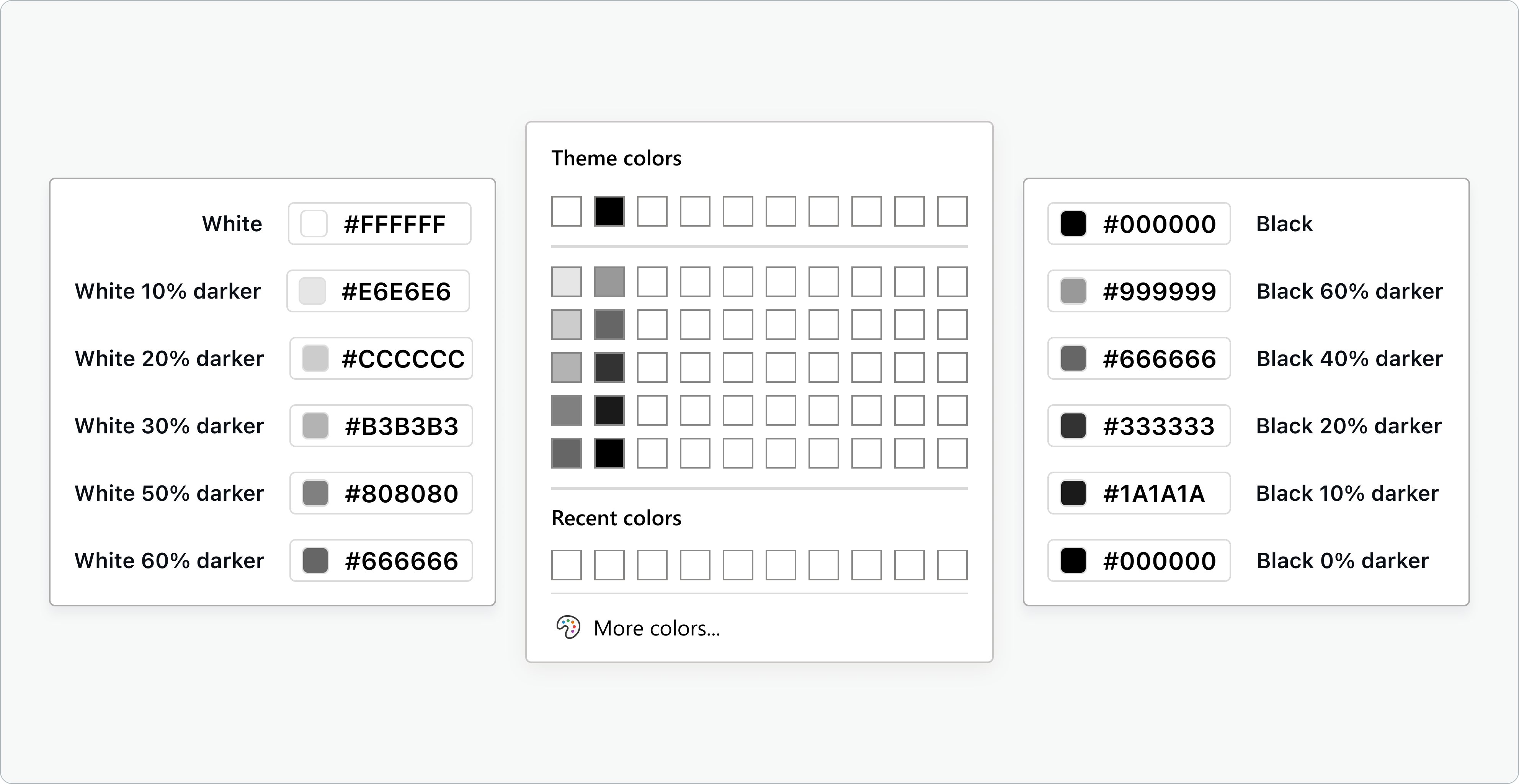
This layout is confusing
The layout can be confusing to apply consistently because there is an overlap in the brightness of colors and an inconsistent progression from white to black which could make it more difficult than it should be to choose your gray colors shown below. In this example, I've only shifted the shades to show the inconsistencies.
Maybe it's just me, but I expect a consistent progression from light to dark as shades move from white to black. However, the presence of a shade that overlaps between the two palettes (black, 40% lighter is the same shade as white, 60% darker) breaks this progression, making it harder to understand the relationship between the colors.
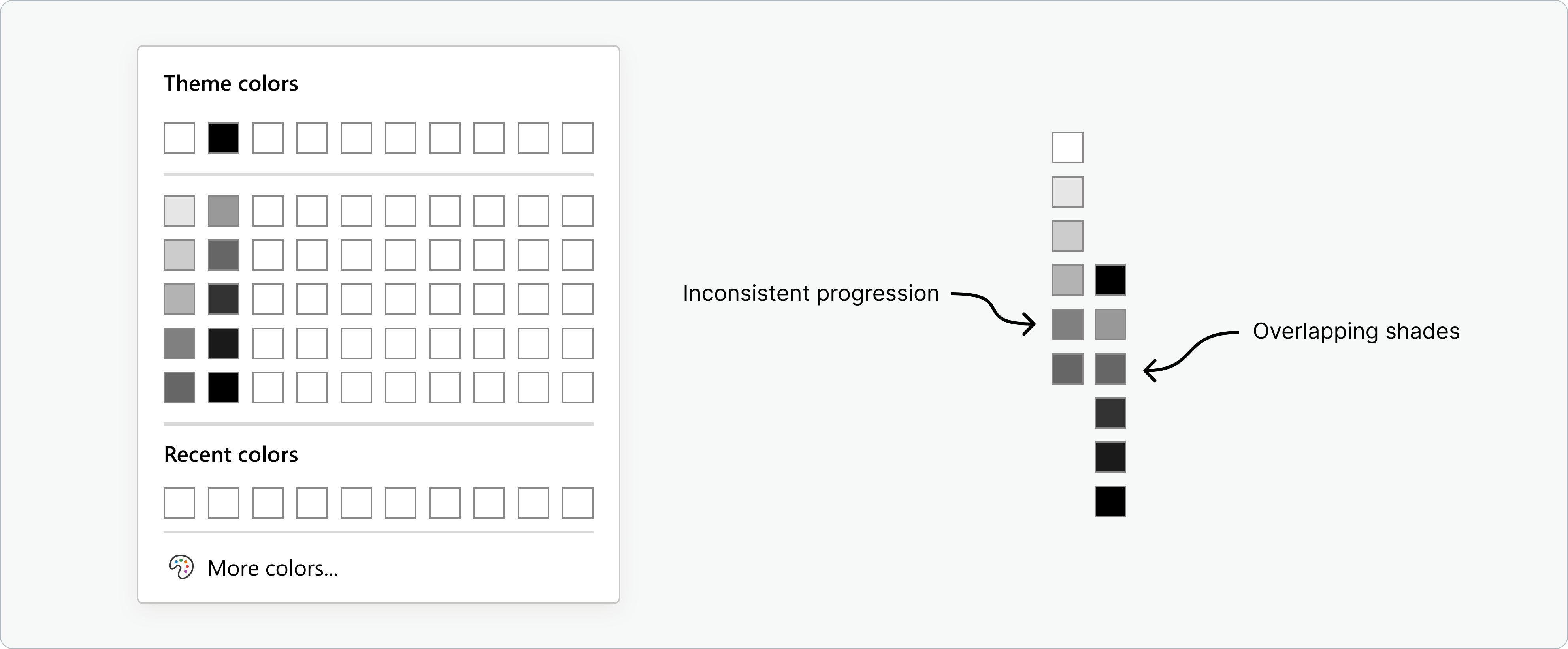
There are duplicated shades
#666666 and black (#000000) are duplicated which means that we could have fit 2 extra shades in this palette making 12 shades! (including white and black) 12 shades is the perfect number in my opinion for modern designs.
If we remove duplicate shades and arrange the colors by brightness, the palette becomes much easier to manage. On the left is the default palette arranged by brightness and on the right is the palette in context numbered by brightness. The x's are the shades to be ignored because they are duplicates.
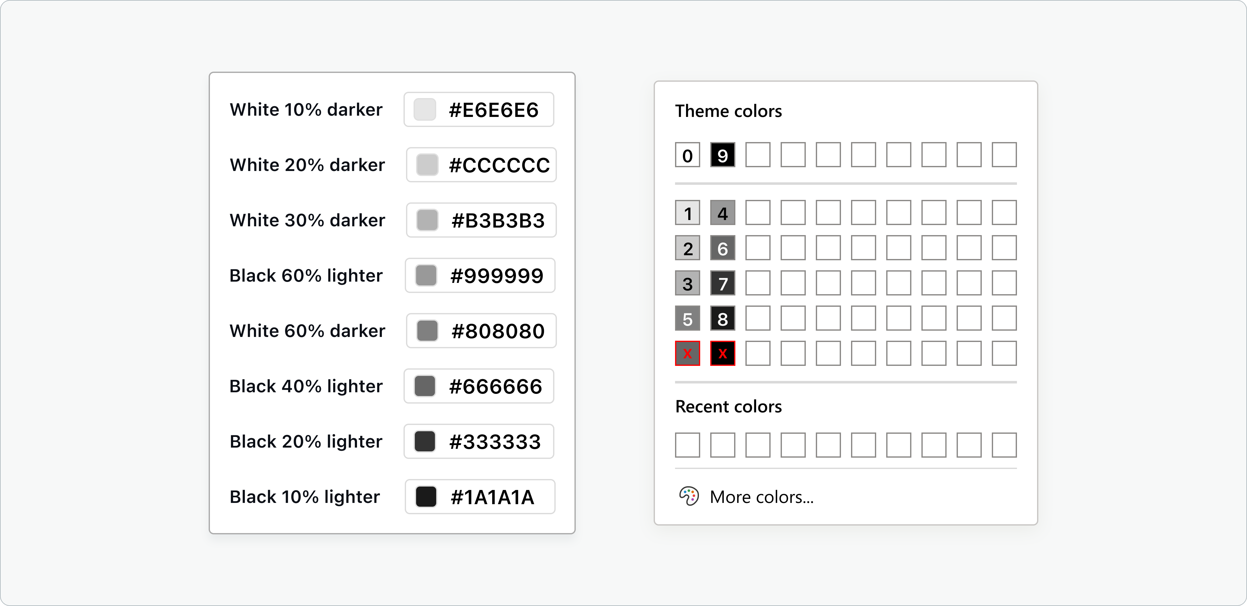
Here's my suggestion for how the grays could be improved in Power BI.

This isn't revolutionary. Tableau uses this many shades of gray.
Conclusion
Neutral palettes may not grab attention at first glance, but they’re quietly powerful in shaping clear, professional, and user-friendly Power BI dashboards. By choosing desaturated shades thoughtfully, mapping them to semantic tokens, and applying them consistently, you’re building a strong visual foundation that highlights your data and guides your users seamlessly. Power UI’s theme generator simplifies this process, turning best practices into effortless workflows—so you can focus less on tweaking colors and more on delivering insights that matter.